
CHEWY.COM REDESIGN
Increasing wayfinding
by reimagining the information architecture

Creating a more intuitive information architecture for Chewy’s website.
Chewy has a robust website offering pet owners one spot to find product and services for their pets. But the site’s size makes it overwhelming for users. Finding the right pet product requires many clicks and can be time consuming and frustrating for users.
The project to redesign the Chewy.com information architecture aimed to:
-
Better align the navigation to users' needs and top business priorities
-
Reduce the time spent searching specific pet products
-
Make it easier for users to compare products
My Roles
-
Information architect
-
UX researcher
Deliverables
-
User personas
-
Gap analysis
-
Tree testing
-
Card sorting
-
Refined IA
-
Sitemaps
Duration
12 weeks
A redesign of Chewy.com’s information architecture would increase user wayfinding and decrease time spent searching.
DISCOVER
USER PERSONAS
Chewy.com's primary and secondary personas highlighted users' desire for efficiency and personalization when shopping for their pets.
To better understand Chewy users, I worked on a project team to develop user personas that identified the characteristics, goals and needs of online customers. This activity revealed two types of website visitors:
01
Owner with pet who has standard feeding and caring needs
02
Owner with a pet with unique health and caring needs.
With both user personas, time was identified as a main challenge, with users looking to easily find products and services for their pet. They also sought a company that loved and valued their pets as much as they did.


GAP ANALYSIS
Chewy’s main navigation focused on medium or low level business priorities and placed pages related to key user tasks deep on sub pages.
Once the project team defined the user personas, we sought to understand the pet-related tasks important to users. We conducted a gap analysis to compare user tasks and business priorities against the Chewy’s navigation. This analysis helped us identify opportunities for improvement in the information architecture.
Hierarchy
The majority of Chewy’s top navigation sections – like pharmacy, brands and Chewy picks – focused on medium or low level business priorities.
Priority
While every high priority task had a page, some medium priority tasks that could have a big impact were buried in the fourth level of navigation.
Structure
All the pet products were categorized under the “Shop” section. Users had to click multiple times to filter products related to their specific pet(s).
Classification
A top user task was comparing prices for similar products. However, users had to navigate to the fourth level of the navigation to complete this task.
The information architecture on Chewy.com did not reflect the organization’s top business priorities or users’ main tasks, creating a poor user experience.
DEFINE
TREE TESTING
Users spent notable time searching pages on Chewy’s website and struggled to find items.
With an understanding of how the navigation reflected (or in many cases did not reflect) user tasks, I led a tree test to evaluate the efficiency of the existing chewy.com navigation.
Users were given the top 25 tasks for the website and asked to indicate where they would go on the site to complete the tasks. Analyzing the results, I found that users consistently struggled to find what they were looking for on the website.

The tree test results showed that users spent notable time completing tasks and followed paths that were not direct.
01
Users looking for general pet products were able to easily navigate through the information architecture.
02
Setting up a prescription on the site was intuitive to users.
Information architecture successes
01
Participants’ first clicks were direct, but their next steps did not follow the prescribed path. This indicated that the navigation was too complex.
02
Users were unable to find specific discounts because the categorization was too complex.
Information architecture challenges
03
To create an account, users went to several pages, which indicated that the path wasn’t intuitive.
CARD SORTING
Users consistently grouped product and account tasks together but had different mental models for tasks related to searching for deals and specific brands.
The tree testing provided insight into the existing Chewy.com navigation and highlighted users’ pain points. The next step was to conduct card sorting to better understand users’ mental models.
I led card sorting with five individuals, observing how they categorized the words and phrases and asking questions about their thought process. These results were combined with the card sorting results of 20 other testers, bringing the total testing number to 25.
From the card sorting results, the project team learned two key insights:
Product tasks
Participants were fairly consistent in grouping product-related tasks together. They also tended to have similar categorizations for account-related tasks.
Deals and brands
Testers had different approaches for categorizing tasks related to browsing for deals and searching for specific brands.
IDEATE
INFORMATION ARCHITECTURE
Following users’ mental model, the project team focused on creating an information architecture primarily focused on product searching with a secondary focus on product comparison.
Based on the results of the card sorting, I worked with the project team to create an initial information architecture. This exercise identified ways to group tasks into categories that better reflected users’ mental models.
I discovered that users viewed searching for products differently than the tasks of comparing different products. They also created separate categorization for order and support tasks.
Based on our analysis, the team created its first version of a sitemap, which prioritized creating sections for product-related tasks.

REFINED INFORMATION ARCHITECTURE
Evaluating the user friendliness of terms used in the sitemap highlighted opportunities to refine product-related language.
To start the refinement process, the project team evaluated the labels used in the initial information architecture. I led efforts to assess each term for the following characteristics:
-
Well-known
-
Easy
-
Real
-
Brief
-
Representative
Using the results of the label scoring, the team developed a new sitemap with terms that had stronger user recognition. We changed the labels of product knowledge and product information to reflect the user tasks of shop, search and discover. We also moved the categories of pet health and new pet essentials to be more prominent in the navigation.

PROTOTYPE
SITE MAP
By developing an information architecture that integrated search into the main navigation, the team aimed to help users more quickly find items.
I led the group in translating the user insights from the ideation phase into sitemap options that aligned user needs with business goals. The new proposed sitemap incorporated Pet Health and New Pet Essentials into the main navigation, both of which had strong information scent.
Knowing that search was a key feature of the website, the sitemap placed Search in the main navigation. It also featured user-friendly terms identified during our research including Explore, Order Prescriptions and Chat with us.

TEST
TREE
TESTING
Testing of the navigation prototype revealed that the new representative labels resonated with users and better reflected their mental models.
Seeking user feedback on the effectiveness of the proposed navigation, I led the team’s efforts to conduct a tree test with 14 users.
Overall the new navigation received a significantly better score, demonstrating that the navigation prototype was more effective than the existing navigation.
Time
spent
Participants were able to accomplish the tasks 41% faster with the new navigation.
Task completion
Users completed the tasks with less clicks.
Usability
"The navigation is much more condensed since there are not as much repeated navigation items." - User
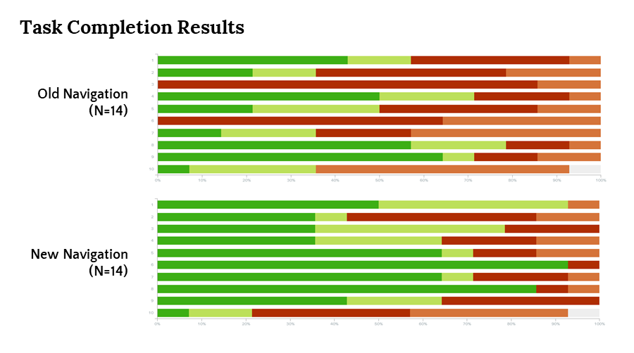
The new navigation not only increased task completion but also decreased the time users spent searching for items.
The user testing verified that using representative labels in the new navigation, rather than marketing language, allowed users to successfully complete the tasks faster.
NEXT STEPS
WIRE FRAMES
Proposing a new navigation for Chewy.com, we developed wireframes that prominently featured search and used terminology focused on key user actions.
Completing our review of Chewy’s website, we used the insights from the tree test to further refine the Chewy website information architecture. The proposed wireframes:
-
Featured search prominently in the top navigation bar
-
Highlighted the key user actions of shop, getting a new pet and pet health

REFLECTIONS
KEY TAKEAWAYS
My work on Chewy.com’s information architecture provided insight into the challenges of effectively organizing a site that is robust and offers in-depth product web pages.
01
Simplicity is key when developing information architecture that is valuable for users.
02
It is important to guide users through the navigation and to prevent the layers from becoming too complex too quickly.
03
User research is vital to selecting navigation terms that reflect users’ mental models and provide strong information scent.